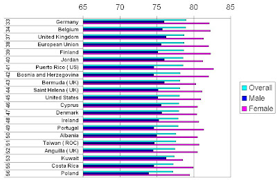
Whenever you read an online article or hear a discussion about the current health care system in the United States someone always points out that we Americans "have the best health care system in the world." And since one of the indicators used to judge how well a health system works is life expectancy I've decided to point out just exactly how good ours in when compared to other countries.
Below I've included information from 3 sources about the life expectancy in the United States compared to a few other countries. I've included the link to the resource that provided the information and you may click on all the charts to see a larger image.These charts represent this data:
Set 2: List by the United Nations (average for the 2005-2010 period)
http://www.un.org/esa/population/publications/wpp2006/WPP2006_Highlights_rev.pdf
These Charts represent this data:
Set 3: 2008 Estimates from the U.S. Census Bureau
http://www.census.gov/compendia/statab/tables/09s1295.pdf
This chart represents this data:Not quite what I expected but we are within a few months of the countries where their life expectancy is longer. Well, except for the number from our Census Bureau where people in Spain are expected live more than a year longer than we do. But since no one ever compares the health care system in Spain to ours we won't bother to mention it either.And I wonder why the CIA gives us less time with 78.06 as compared to the Census Bureau's 78.1 and the UN's 78.2. (Think they know something we don't?) Anyway there's not much difference in the U.S. results since .06 is 21.0 days, .1 is 36.5 days and .2 is 73 days. And using this data I think we can all hold our heads up high and say that the life expectancy for the babies born in the U.S. this year is a little more than 78 years.
Now you may have noticed that some of the countries we compare our health system against aren't shown on the above charts. That's because their numbers didn't appear on these charts close to ours. So to save space I just included the countries with the numbers closest to ours.
But since we all want to be able to talk about how our health care system compares to those in Canada, England (United Kingdom), France and the Netherlands I've put their numbers for overall life expectancy along with ours in the following table. Since the UN numbers seem to be in the middle of the other 2 sources I've use their data and just for the fun of it I've included
Australia.
I give up. Maybe life expectancy isn't the way to prove the U.S. health system is the best in the world since all the countries we compare ourselves to have a longer life expectancy. Of course we could start comparing our system to countries like Kuwait, Mexico, Albania and Poland because it is better than theirs. Or maybe next time I'll use a different criteria like infant mortality rate. Since we are 1 of the most technically advanced nations in the world the number of infants that die in America has got to a lot lower than everyone else.
Hope all the kids born in the U.S. this year don't mind living 1 to 3 years less than those "other" countries.
SusanP.S. And in case you're wondering if the life expectancy of Australia is the longest, it's not. According to the UN and the Census Bureau Japan beats everyone with an expectancy of 82.6 and 82.1, respectively.


No comments:
Post a Comment